Task 2
This is my second post, where I will showcase three websites that, in my opinion, represent outstanding design.
” Design is not just what it looks like and feels like. Design is how it works ” – By Steve Jobs.
I will showcase three websites that, in my opinion, stand out for their exceptional design. They each combine creativity, functionality, and attention to detail, making them excellent examples of modern web design.
Airbnb
The Airbnb Website is designed to provide a seamless, user-friendly experience for booking unique accommodations and activities worldwide where one can have. The site also uses high-quality visuals and simple navigation to keep the users engaged.
Here’s a closer look at why Airbnb’s website stands out good website
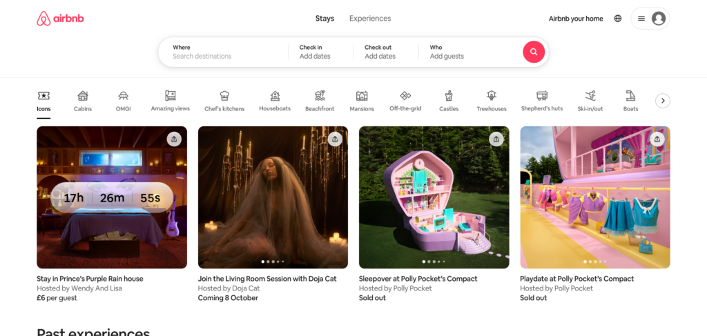
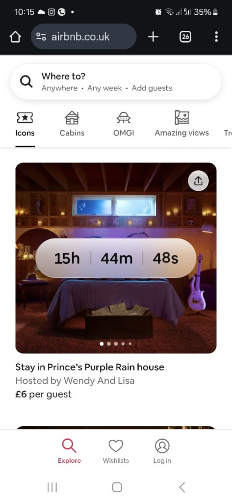
The homepage immediately engages visitors with high-quality imagery, showcasing various destinations and accommodations, which inspire travel and exploration. The search functionality is clear and simple, allowing users to quickly filter results by location, dates, and preferences, enhancing the booking experience.
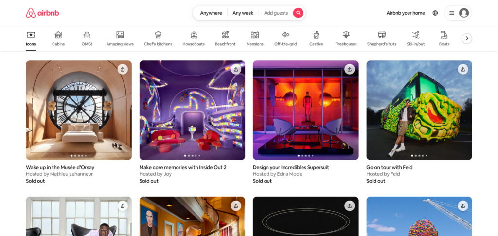
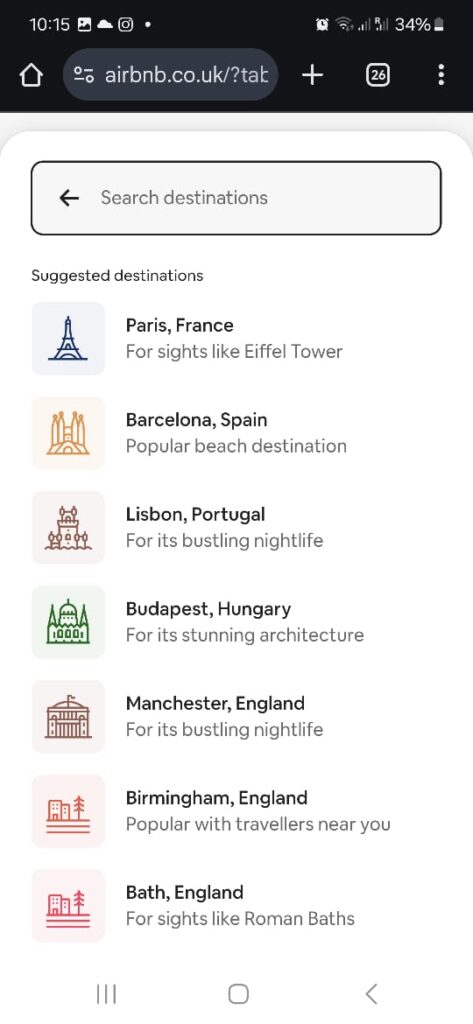
There are different categories where user can select according to their preference which searching. Even the platform’s navigation bar also adjusts based on the user’s journey, becoming sticky when one scrolls, which allows for easy access to important options like log-in, sign-up, or search tools without scrolling back to the top which makes it more intuitive.
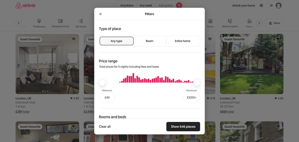
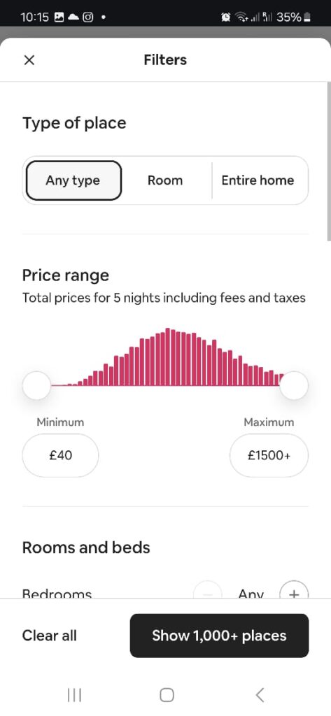
The filter system is smart and user-centric, allowing users to quickly find any type of place that meet their specific needs, such as pet-friendly stays, can adjust the price range according to the users needs, free Wi-Fi & different amenities, or those with flexible cancellation policies.
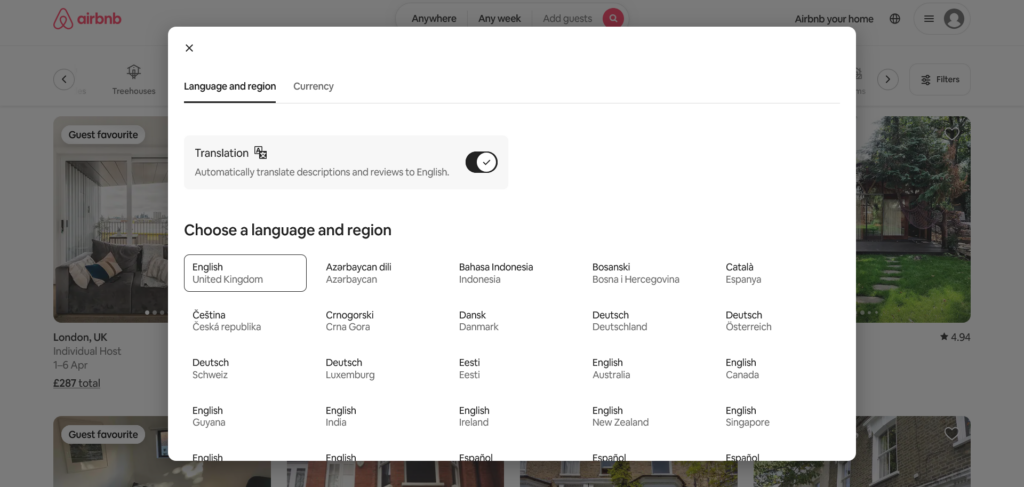
Selecting the language & region tab and currency tab screen displays a clean and intuitive design. The toggle for automatic translation is prominently placed, making it easy for users to understand and control language settings. Additionally, the clear segmentation of languages in alphabetical order ensures quick navigation and selection, enhancing user experience.
The Airbnb maintains consistent branding, color schemes, and typography, icons illustrations creating a cohesive experience from the homepage to individual listing pages.
The Airbnb’s website is also fully optimized for mobile use as well, offering a seamless experience for the users where they can easily search, book, and manage their reservations without any hassle.
What I like about Airbnb, it has a beautiful design with a simple user interface, and how it has a balance aesthetics with functionality to create a smooth, engaging user experience.
Walmart
The Walmart Website offers a user-friendly platform that allows users to easily browse and shop a wide range of products, from groceries and electronics to clothing and home goods. This website exemplifies effective design through simplicity, accessibility, and user-centric features.
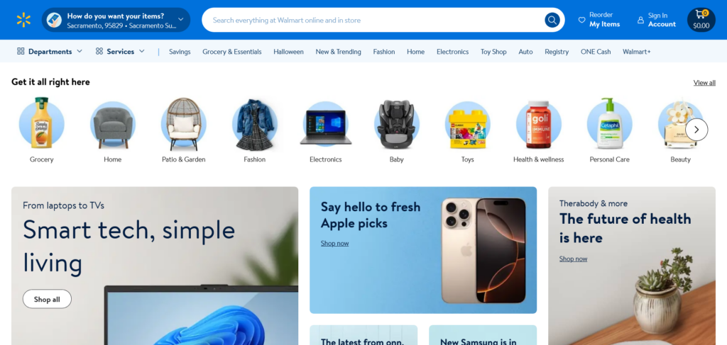
The website layout is clean and easy to navigate, by allowing users to quickly find what they need. The homepage prominently displays essential categories like groceries, electronics, and clothing, making it convenient for users to explore different sections without feeling overwhelmed.

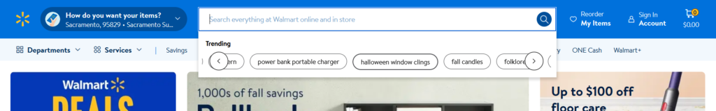
The search functionality is good, because it provides with auto-suggestions that guide users to relevant products, saving time and enhancing the shopping experience.

The sub-category menu on the walmart website is designed for simplicity and ease of use, offering quick access to key departments and services where I feel the menu is well-organized which allows for efficient browsing, and helps users locate products and services quickly. The departments and services, these two drop-down menus allow users to browse Walmart’s full range of product categories and services, providing a comprehensive overview of what the store offers and the other Key Categories are the direct links to popular shopping.
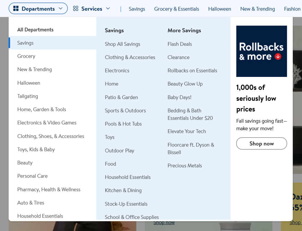
Talking about the navigation menu it is straightforward and easy to navigate.
Walmart’s website has a clean and modern typography that enhances readability and user experience. The fonts used are sans-serif which it provides a contemporary feel that aligns with the brand’s approachable image. Hierarchy is clearly established by different font sizes and font weights. Also, consistency in font usage throughout the website reinforces brand identity and makes the experience seamless. The visuals of the website feature high-quality product images and simple icons.
Revolut

The Revolut Website is a digital platform designed for financial services, including banking, payments, and currency exchange. It is a sleek, modern design that reflects the company’s innovative and tech-forward approach to finance.
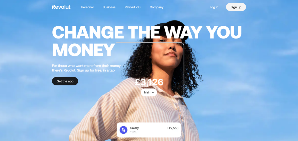
The website has a clean and modern design which is visually appealing as it uses a minimalistic design that keeps the interface uncluttered. The homepage emphasizes white space and bold, contrasting elements, giving a fresh and professional feel.
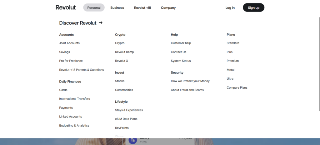
There are only 4 sub-menu which are simple and easy to understand. The navigation menu is also straightforward where users can easily explore the different services offered based on their needs.
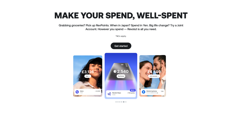
The website has engaging typography and visuals, and the typography is clean and modern, with bold headers and simple body text that enhances readability. Also whatever the key features and services are there it has been highlighted through high-quality visuals and animations, this gives the users a clear idea of the product’s capabilities. Talking about the colors used in the revolut website it only has 3 primary colors black, white and grey.
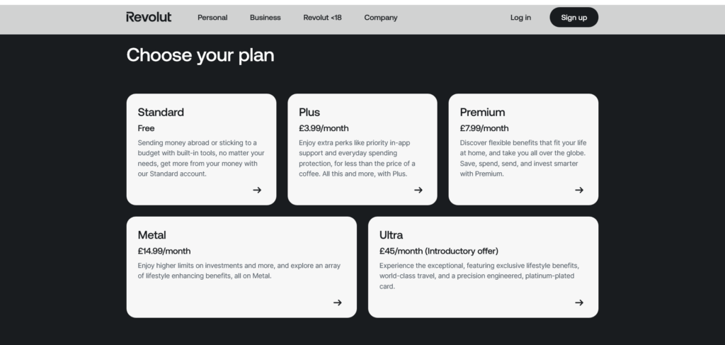
In choose your plan it has a card-based layout that clearly presents each account plan. With bold titles, prices, and concise descriptions, that allow for easy comparison. The cards are well-spaced, ensuring a clutter-free experience, while the dark background contrasts with the white cards for readability. Simple arrows guide users to explore more about each plan, creating a visually appealing and intuitive interface.
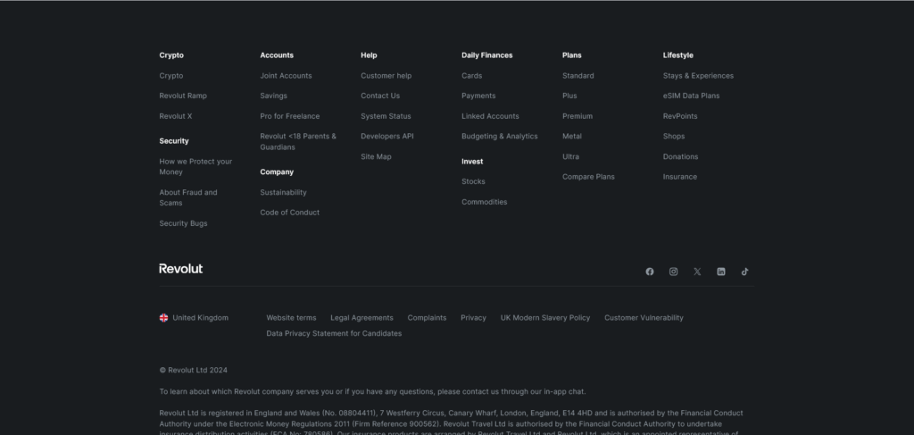
Also, the footer section is very well-organized with proper spacing.
Overall, the combination of aesthetics, ease of use, and technical efficiency makes Revolut’s Website a prime example of good web design.
Leave a Reply