My Design Process for Ashton’s Cheeses Website

For my small business website project, I chose Ashton’s Cheeses a high-class cheesemonger and delicatessen. The objective was to create a HTML and CSS website for a fictional small business based on a campaign to promote local high-street shopping. And the website is not an e-commerce site, it is a marketing tool which will be used to encourage people to visit the shop premises in person. This project allowed me to apply my skills in HTML, CSS, and interface design while also focusing on creating an engaging user experience.
To begin with how I reflected on the journey of creating the website for Ashton’s Cheeses:
1) Understanding the Brief
The first step was to thoroughly understand the project brief. As I was clear with my objective for this project. So the site needed to be informative, engaging, and reflective of the brand’s high-quality products.
2) Researching:
I looked at a few cheese websites and similar-themed sites to gather inspiration and understand best practices. And this research helped me to identify that few key elements such as what kind of content need to be added, clear navigation, visual appealing. Because for a user, the important information to show in the website is about location, contact number, shop timings, information about cheese and what types of cheeses are there. And then other information such as about us page, events page will be also added. Paxton&Whitfield, The Cheese Society, The Cheese Lady, Mons Cheesemongers, here are the few competitors that provided me the insights.
3) Content Creation
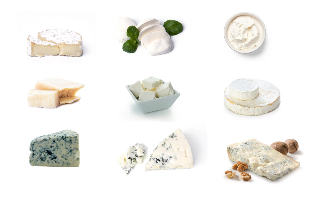
I started gathering relevant information like what kind of content need to be added for product descriptions. For contact details, I added a random number which is not valid and so far for email ID as well. For location, I have used Google Maps API. I sourced visuals from Unsplash and Freepik like what kind of images/visuals need to be added. For other content like in about us page, welcoming message I wrote it myself. So to ensure the content should be engaging and informative, as it needed to attract and retain visitors’ attention.
4) Planning
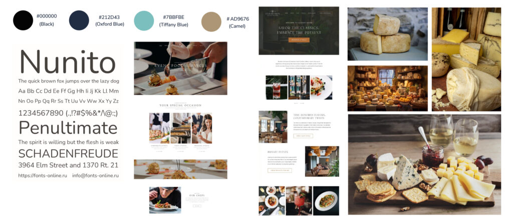
Next, I created a mood board to visualize the overall aesthetic of the site. I also created a few screens in Adobe XD, so that I can get an idea of how my layout would look in the development phase by ensuring the site looks great on both mobile and desktop devices.
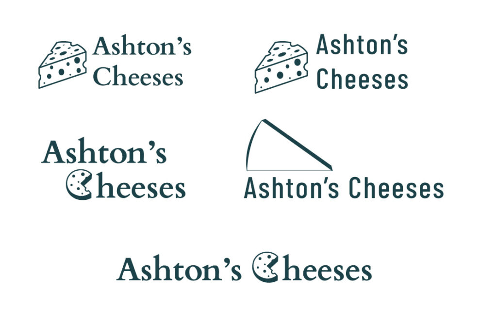
A) I decide on the color scheme that is showed in the moodboard because:
- #7BBFBE (Tiffany Blue): This color provides a fresh and modern feel, by symbolizing quality and sophistication. And this color I have added while doing links in hover state.
- #212D43 (Oxford Blue): This color will add a sense of trust and reliability, & providing essential for a high-class business.
- #AD9676 (Camel): This color provides a warm and earthy tone, reflecting tradition and artisanal quality.
B) About typography, I decide to choose Nunito as my typeface for the website, as this as a rounded typeface which will make it a friendly and professional site.
C) Regarding imagery, I have used high-quality images and for product images I have used which have white background so that I have given a visually appealing look to keep the users engaged on the website.
D) I have used few design elements like:
- Clean and Simple Layout: So that it is easy to navigate, with clear sections for different types of information (e.g., product descriptions, contact details, opening times).
- Whitespace: I have used effective use of whitespace to make the content stand out and improve readability.
4) Development
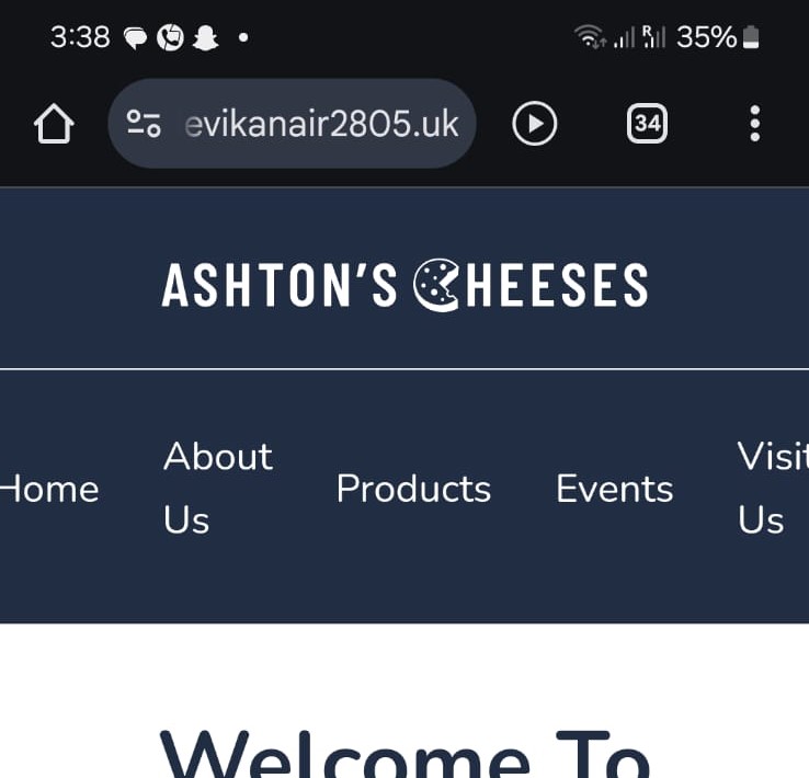
I adopted with mobile approach first, by starting with the layout for smaller screens and then enhancing it for desktop by using media queries. Initially, I found it challenging to make it responsive, but gradually I succeeded. But there still there is an issue in mobile for header and footer section because in my device it’s not displaying properly, but in other’s phone while I was testing it was working fine.
5) Testing
Testing was a crucial part of this process. I validated both the HTML and CSS using W3C validation to ensure there are no error’s in it. I also used Google PageSpeed Insights to test the performance of the website. And this tool provided me the valuable insights into how the site performed well on both desktop and mobile devices. While the desktop performance was excellent it was 95 and above, where I encountered some issues with the mobile version in which the performance was 80 and above.
6) Reflection
It was very interesting to work on this project and throughout this I learned a great deal about the importance of planning and the value of semantic HTML. For me one of the most challenging aspects was ensuring the site was fully responsive and performed well on all devices. The feedback from PageSpeed Insights was invaluable in this regard, as it highlighted specific areas that needed attention.
In conclusion, for me overall, this project was a valuable learning experience. And I am proud of delivering the final website and the skills I developed along the way for making this Ashton’s Cheeses website and also helped me to gain knowledge in a practical setting and gain insights into the importance of user experience and performance optimization.
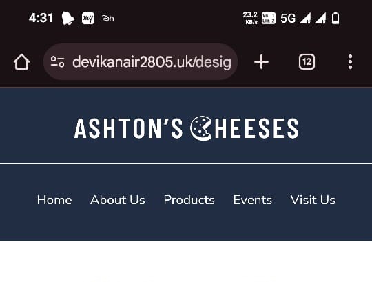
You can view the completed website here!!
https://devikanair2805.uk/design-for-web-content/small-business-website/index.html
Leave a Reply