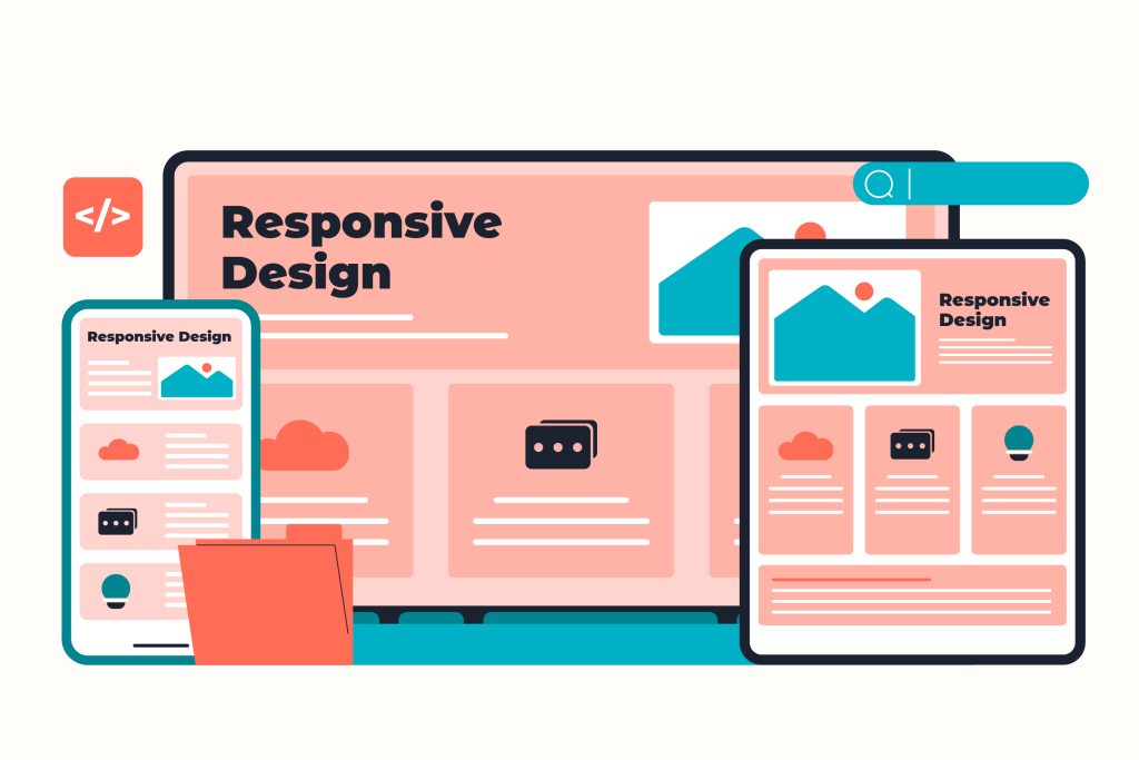
Introduction
Responsive web design has been a cornerstone of modern web development since Ethan Marcotte introduced the concept in 2010. For over a decade, we’ve relied on viewport-based media queries as the standard approach, often implementing a mobile-first methodology. However, as web applications have grown increasingly complex with component-based architectures, the limitations of traditional media queries have become more apparent.
This article explores container queries – a new feature in CSS that’s transforming how we approach responsive design.
The Evolution of Responsive Design
Responsive web design has evolved significantly since its inception. Traditionally, web design has relied on:
- A viewport-based approach using media queries
- Mobile-first methodology
This methodology has served us well for over a decade, allowing websites to adapt to different screen sizes and devices. However, as web applications have grown more complex, with increasingly modular designs and component-based architectures, the limitations of media queries have become increasingly apparent.
The Limitations of Traditional Media Queries
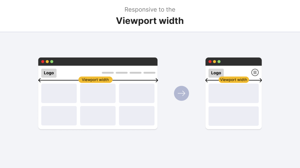
Many aspects of media queries are composed using global breakpoints that target the viewport, abstracting how a component is used in context by applying the same styling rules regardless of location. Although this works effectively for layout changes across a whole page, it isn’t ideal when you have specific requirements for individual components.
Media queries operate at the viewport level, meaning they respond to the size of the browser window rather than the context in which a component is placed. This creates several challenges:
– Global Breakpoints vs. Local Components
Media queries enforce global breakpoints across the entire page. This means that when a breakpoint is triggered, it affects all components on the page, regardless of their individual context or requirements. The rigidity of global breakpoints can impede the creation of entirely reusable and modular components (Marcotte, 2010).
– Inflexibility in Complex Layouts
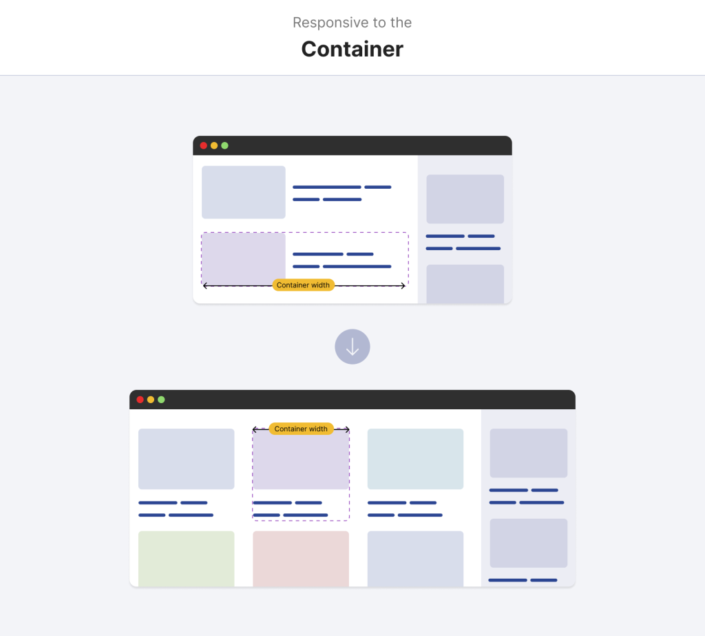
In modern web applications, components often need to adapt based on their immediate container, not just the viewport. For example, a card component might appear in the main content area, a sidebar, or a modal window—each with different available space.
– Consistency Across Container Sizes
Maintaining consistent component behavior across different container sizes becomes challenging when relying solely on viewport-based media queries. A component that works well in a full-width layout might break or appear awkward when placed in a narrower container.
What are Container Queries?
With container queries, you change the paradigm from the viewport to the immediate parent container size. In practical terms, this means a component can modify its styles (including font size, padding, or layout) depending on how large or small the container in which it lives.
Container queries provide the advantage of managing design more granularly because each component becomes reactive to its context rather than following a global one-size-fits-all rule. They are essentially like media queries, but scoped to occur for specific components. This technique makes component reuse more intuitive because a component’s design can adapt differently, irrespective of where it is placed on the page (CSS-Tricks, 2023), enhancing modularity.
– Definition
Container queries allow you to apply styles to elements based on the size of their containing element, not just the viewport size. This means components can adapt to their immediate context, regardless of where they’re placed in the layout.
– Concept
The core idea behind container queries is that content styles should be able to adapt to their container’s dimensions. This creates a more modular and reusable approach to responsive design, where components can be truly self-contained.
– Analogy
The closest analogy is to media queries, but with a scope limited to a specific component rather than the entire viewport. This allows for more granular control over how components respond to their environment.
Comparing Container Queries and Media Queries
The main difference between both types of queries is their influence’s scope.
| Feature | Media Queries | Container Queries |
| 1) Scope | Entire viewport | Individual container |
| 2) Flexibility | Static breakpoints | Dynamic adaptation |
| 3) Use Case | Layout-wide adjustments | Component-level adjustments |
The style changes triggered by the media queries are based on the size of the whole viewport, so they change the entire page’s layout. This solution might be useful for global changes but cannot support unique demands in isolated parts. Secondly, container queries evaluate the dimensions of a given parent container and enable writers to fit styles to a component. This localised method provides significant benefits in design flexibility and component reusability. Other than that, media queries establish wide rules that are authentic on a site, but container queries allow the developers to compose parts that reform according to their immediate surroundings, resulting in a more delicate and aware design solution (W3C, 2022).
Code Comparison
Container queries use a similar syntax to media queries, with @media for media queries and @container for container queries. However, the way container queries are implemented and the scope of the effect is fundamentally different.
How it works?
Here is the HTML code
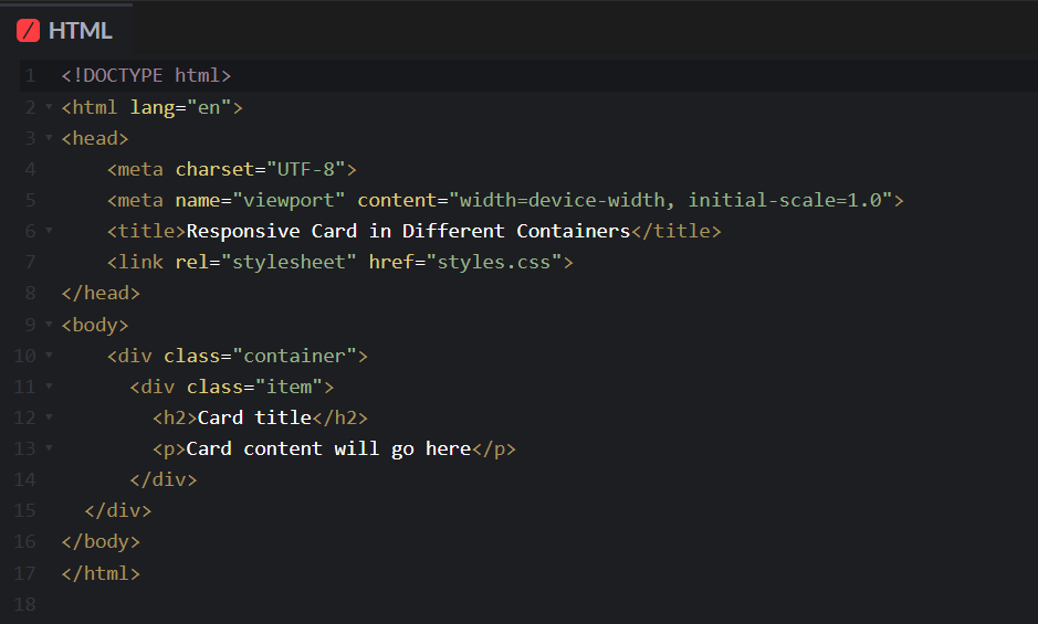
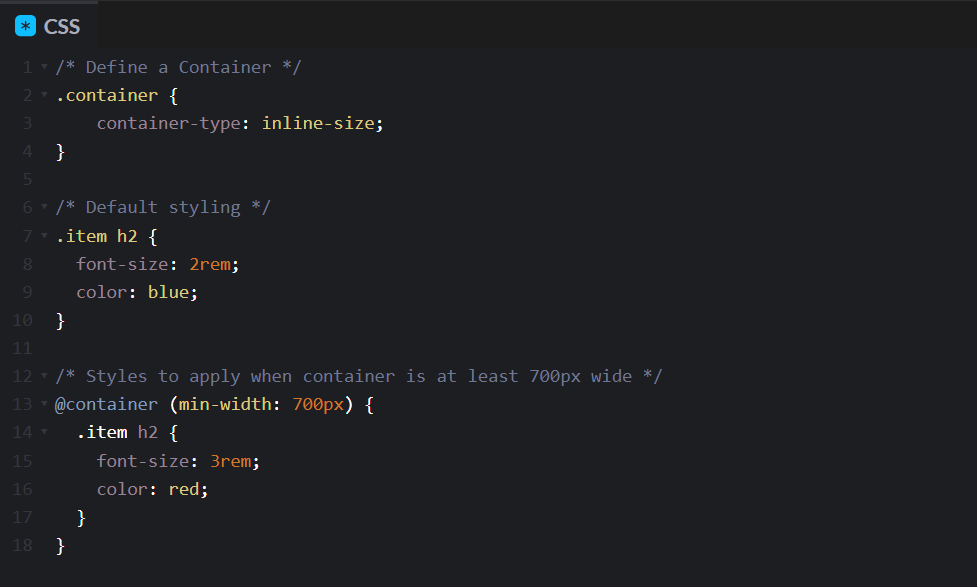
1. Define a Container
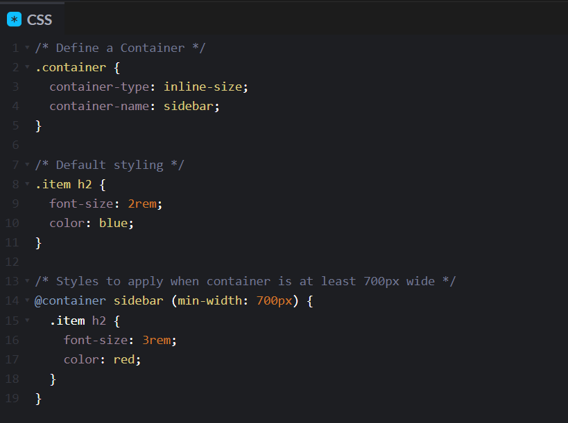
First, you need to define a container by using the container-type property on the parent element.
.container {
container-type: value;
}
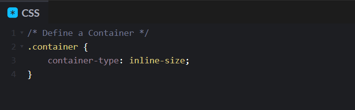
In CSS code the value is inline-size.
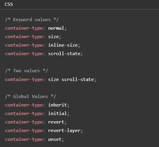
And the container-type property can have different values:
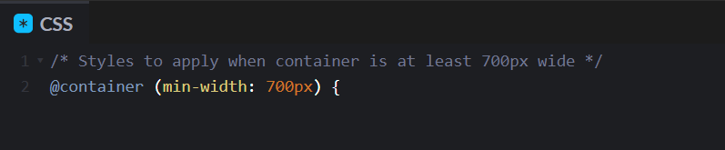
2. Write Your Query
Next, you write your query using the @container rule with size conditions like min-width or max-width:
3. Style Elements Within the Container
Finally, you can style elements within the container based on its size.
Naming Containers
If you have multiple containers and need to target a specific one, the container-name property can be used.
.container {
container-name: give a name to the container;
}
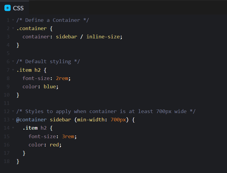
Shorthand Syntax
There’s also a shorthand container syntax where you combine container-name and container-type in one line using the container property
Practical Use Cases
Credit: @shadeed on Codepen
Newsletter – CQ: https://codepen.io/shadeed/pen/poRLxvO?editors=0100
Pagination – CQ: https://codepen.io/shadeed/pen/VwPQORy?editors=0100
Profile Card – CQ: https://codepen.io/shadeed/pen/NWdYaGY?editors=0100
Few more great examples here by Ahmad Shadeed, which showcase how container queries enhance component responsiveness.
Container Query Length Units
Container queries also have a new set of units called container query length units. These work similarly to viewport units like vw and vh, but they’re relative to the container dimensions instead of the viewport. And there are six units and these units are used for creating a fluid typography and other size-relative styles within containers.
| Units | Meaning | Example |
| cqw | 1% of the container’s width | width: 50cqw; (50% of the container’s width) |
| cqh | 1% of the container’s height | height: 20cqh; (20% of the container’s height) |
| cqi | 1% of the container’s inline-size | font-size: 5cqi; (Font size scales with container width) |
| cqb | 1% of the container’s block size | padding: 3cqb; (Padding scales with container height) |
| cqmin | The smaller of cqi or cqb | border-radius: 10cqmin; (Scales with the smaller dimension) |
| cqmax | The larger of cqi or cqb | border-radius: 10cqmax; (Scales with the larger dimension) |
Benefits of Container Queries
– Enhanced Modularity:
Elements implementing container queries will adapt to the size of their container. This implies that a single component can be iterated for various situations without extra style overrides or new media query rules. Modular improvement simplifies upkeep and makes development operation workflows more conservative.
– Improved Control:
With container queries, the designer is given more control over individual elements. Developers don’t have to depend on broad breakpoints that result in all components responding in the same way to bigger containers; they can program behaviour that happens with particular container dimensions. However, it leads to more predictable and consistent component behaviour across different contexts and improved control.
– Cleaner Code:
That is one reason why container queries are cleaner and more maintainable CSS. This reduces using several global media queries for a more organized code base. Less overlapping styles? Well, that makes the job of debugging and future modifications easier. Hence, the design systems become more scalable (CSS Tricks, 2023).
Practical Implementation Tips
I didn’t cover these points during the presentation, but here are some practical implementation tips.
– Test in Controlled Environments:
Start with isolated or non-critical sections of your project and implement container queries there. With this, you can assess their behaviour without harming the users’ overall experience.
– Use Polyfills:
Container queries, however, can have a polyfill available for browsers that do not yet support them. This lets you guarantee that your work will break down gently and keep operating in all user surroundings.
– Integrate with Existing CSS Methodologies:
Consider how container queries mix with your present CSS structure, such as BEM (Block Component Modifier) and CSS-in-JS. This integration is a better habit as it improves consistency in your current codebase.
– Monitor Browser Updates:
Pay attention to what browser support has been evolving into and how the community thinks an application should be built. Keeping an eye out for updates in MDN Web Docs and W3C will ensure you can regularly assess your implementation strategy based on the technology’s maturity.
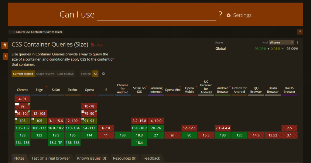
Browser Support
According to the CanIUse.com website, most of the modern browsers support CSS container queries. For more details you can check here.
The Future of Responsive Design
Container queries will open the door for many component-based approaches to become more prevalent. I suspect container queries will eventually become standard in the responsive design toolbox as the support grows in browsers and the standards fully mature. This evolution of the web is a promise of the web that is, by default, more adaptable, more intuitive, and more scalable. As each component adjusts to its own context, container queries encourage a more organic and efficient design and certainly align with the growing complexity of today’s web applications (Marcotte, 2010).
Conclusion
Container queries represent a significant evolution in responsive web design, shifting our focus from viewport-based to component-based responsiveness. With container queries, individual components can adapt their layout based on the size of their container, enabling truly modular components that can function beautifully in any context.
Although there are still some challenges related to browser support and potential performance considerations, the benefits are substantial: increased modularity, enhanced control over design elements, and cleaner, more maintainable code. As technology advances, container queries will likely become an integral part of designing flexible, component-based web interfaces.
Slides Presentation
References
CSS-Tricks, 2023. An Introduction to Container Queries. [online] Available at: https://css-tricks.com/an-introduction-to-container-queries/ [Accessed 20 March 2025].
Marcotte, E., 2010. Responsive Web Design. [online] A List Apart. Available at: https://alistapart.com/article/responsive-web-design/ [Accessed 20 March 2025].
MDN Web Docs, 2023. Using Media Queries. [online] Mozilla Developer Network. Available at: https://developer.mozilla.org/en-US/docs/Web/CSS/Media_Queries/Using_media_queries [Accessed 20 March 2025].
W3C, 2022. CSS Containment Module Level 3. [online] World Wide Web Consortium. Available at: https://www.w3.org/TR/css-contain-3/ [Accessed 20 March 2025].
Leave a Reply